


👋 Welcome to this week’s edition of Empathy Engine. Every Wednesday, I publish a new article for paid subscribers first, then unlock the full piece for everyone late Thursday morning. Each week, I turn product leadership friction into practical tools, sharper language, and more defensible decisions.
Research Binder: the receipts (citations + source notes) are compiled in a PDF at the bottom of this post.
If You’re Skimming
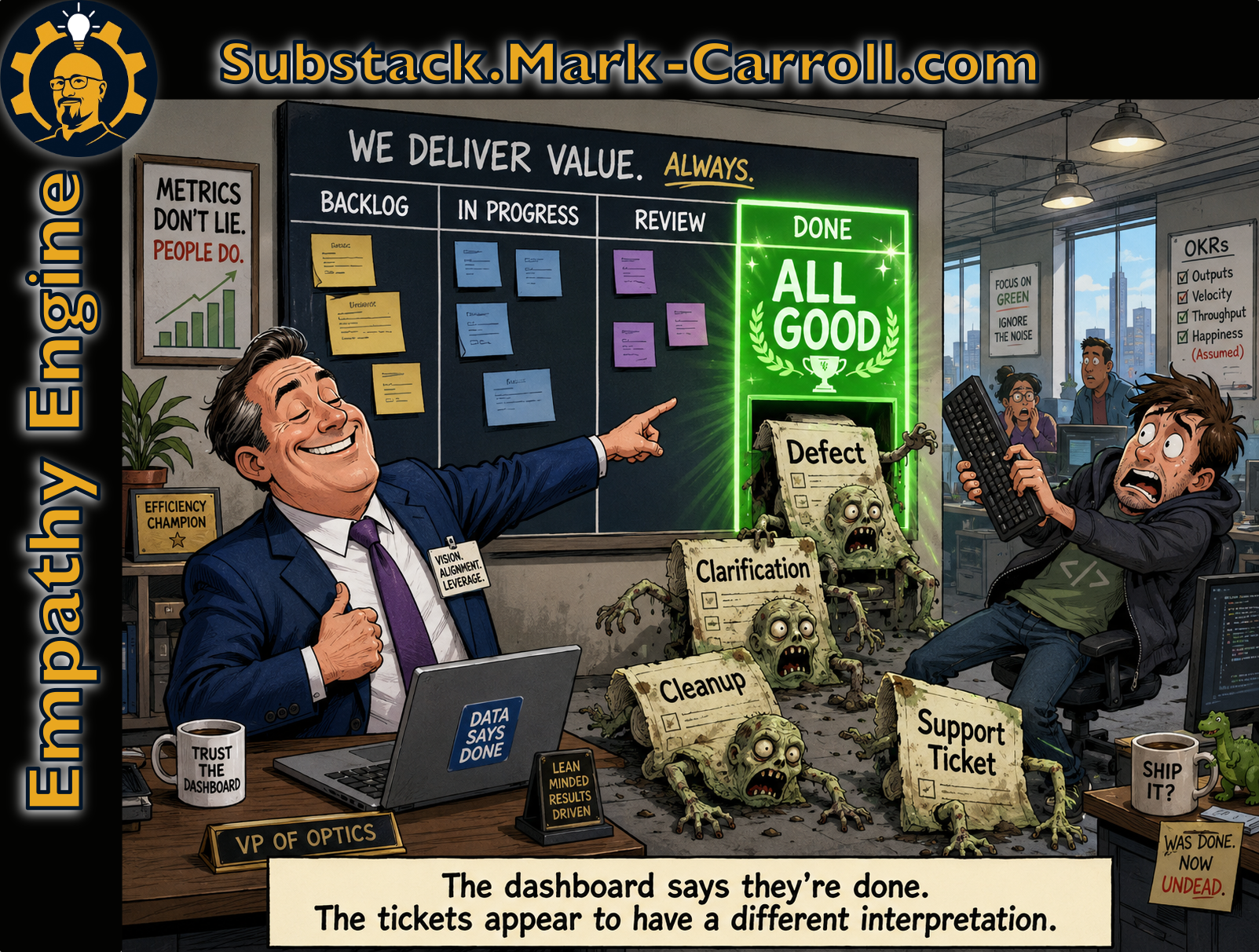
A green velocity dashboard usually measures closure, not durability. It can look healthy while last sprint’s work quietly comes back.
This is the QBR Mirage: the visible numbers are real, but they get mistaken for the whole landscape.
The hidden follow-on work is the Rework Shadow. Closure is a status. Completion is a result. A story can be closed and incomplete at the same time.
Run the Five-Story Field Test at the bottom to see how much of your own “done” did not stay done.
The point is route repair, not blame. Velocity is a useful local signal. It just needs witnesses.
The QBR Mirage
The meeting looked clean. Talia, the product lead, walked the room through a polished quarterly deck. Velocity was up, stories were closed, the sprint trend was green, and the dashboard had that calming corporate glow that makes everyone exhale at once. Leadership saw the chart and heard the story they wanted to hear: the team is moving, the work is flowing, the plan is safe. Nothing in the room suggested danger, which is usually how the most expensive problems prefer to enter.
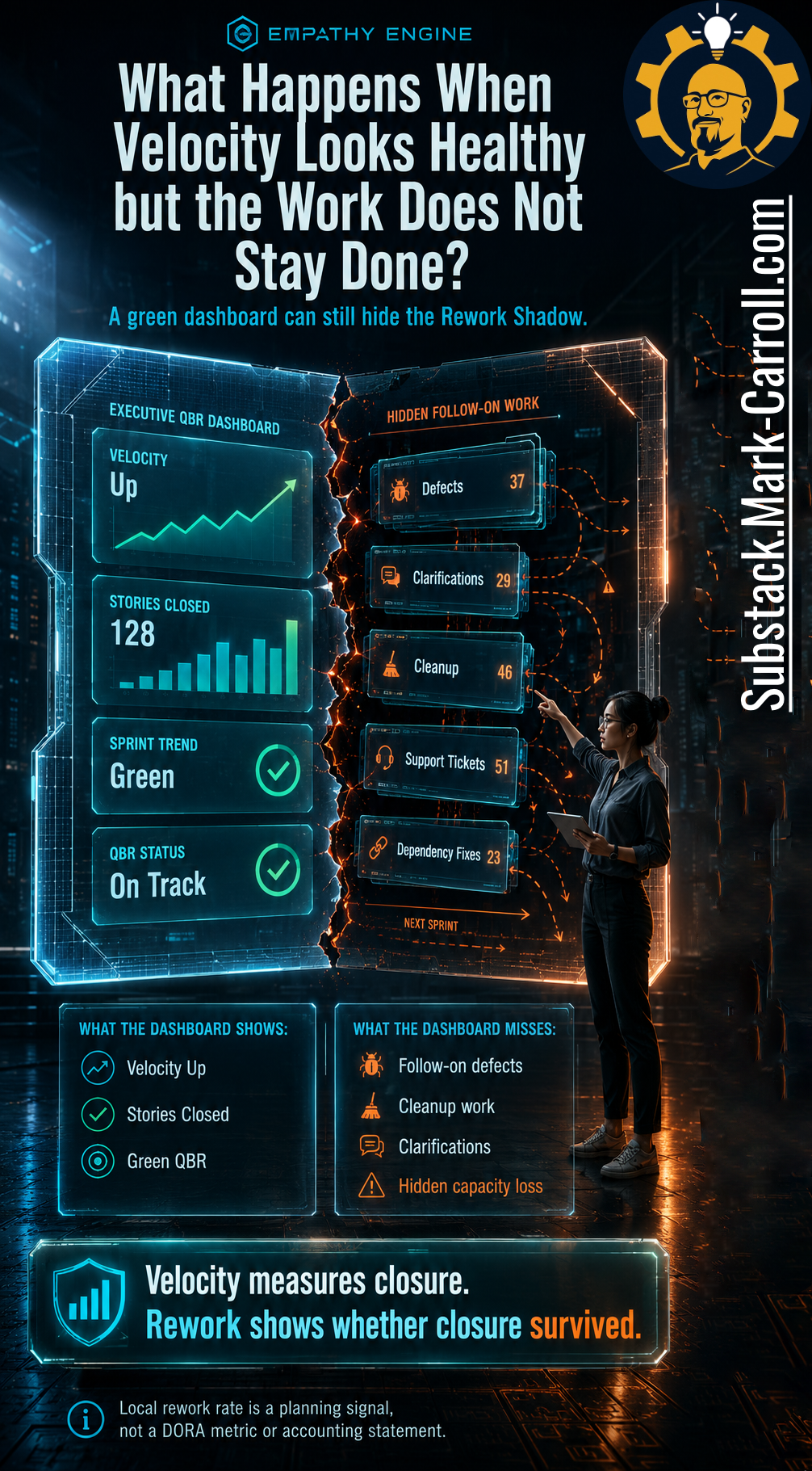
In the room with Talia was Dev, the delivery lead, who had read the same green dashboard all quarter and reported it upward as a health signal. Three weeks later, Marcus, the engineering manager, ran a quiet analysis on the last two sprints. A defect had come back from something marked done, followed by a clarification ticket, a cleanup task, a support issue, and a dependency fix that technically belonged to last sprint but showed up in this one. No single item looked dramatic enough to challenge the dashboard. Together, they raised the question the dashboard had never been built to answer: did the work stay done?
Talia, Dev, and Marcus are composites, not a disguised client or one remembered meeting. I use them because the pattern is real even when no single incident should carry the whole argument. The names change, the tools change, the industry changes. The move does not. The numbers look healthy, the room relaxes, and nobody checks whether the work survived.
Here is my confession. I have sat in that QBR. I have felt the room exhale at the green dashboard, nodded along with “keep this momentum,” and then planned the next quarter against numbers I should have questioned. I have stood inside that moment in Azure DevOps, scrolling back through completed work and feeling the floor drop when the follow-on tickets started tracing back to stories the dashboard had already counted. I was not careless. I was doing the thing competent people do under a clean chart: I trusted closure as if it were completion.
The dashboard did not lie. A lie would be too simple and too comforting, because then we could blame the report and move on. The harder truth is that the dashboard told only the part of the truth it was designed to see. It saw closure, counted points, and surfaced activity. What it did not show was whether that closure survived contact with users, dependencies, support, production, and the next sprint.


This is the same failure this series keeps following, one layer deeper. In Episode 1, a warning died in a busy channel because receiving is not routing. In Episode 2, a handoff became a gap because a closed ticket is not a completed handoff. In Episode 3, a gate lived on the diagram but stopped operating in the work. Episode 4 follows the pattern into the dashboard, where closure quietly stands in for completion and the metric reports progress the system has not actually kept.


That hidden follow-on work is the Rework Shadow. The Rework Shadow is not always scandalous or even obvious in the moment. Sometimes it appears as defects, clarifications, cleanup, support tickets, dependency fixes, reopened items, and small pieces of “just one more thing” that return after the original work was counted. No single follow-on ticket proves the system is broken. Patterns prove something. When enough “done” work keeps coming back, the team may be borrowing capacity from the future while reporting progress in the present.
What Does a Green Velocity Dashboard Fail to Show?
A green dashboard shows movement, and movement matters. Teams need to know whether work is flowing, leaders need signals, and product planning cannot run on vibes or the sacred spreadsheet someone updates at midnight. The problem is not that dashboards exist. The problem is that a dashboard can show visible progress while hiding invisible drag.
A velocity dashboard can tell you stories closed, points counted, sprint trend improved, and status green. Those signals are not worthless. They become dangerous only when we treat them as complete. What the dashboard may not tell you is whether the same work came back wearing a different ticket number, landing in a different queue, or quietly consuming a different team’s capacity.
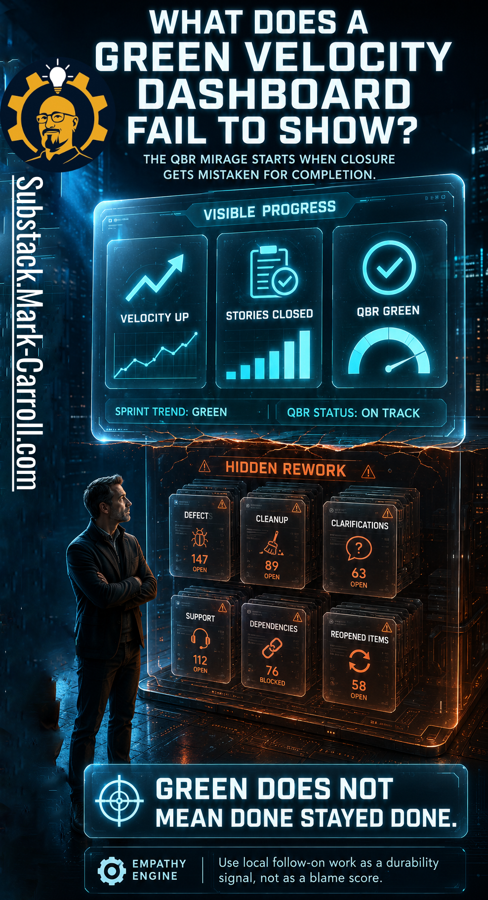
This is the QBR Mirage. From above, the surface looks calm. Velocity is up, stories are closed, and the status is on track. Underneath, work may still be accumulating as defects, cleanup, clarifications, support, and reopened items. The mirage is not that the visible numbers are fake. The mirage is that the visible numbers get mistaken for the whole landscape.
It helps to notice who builds this route, because no one builds it on purpose. The same practical lens from earlier episodes applies here, and it is a lens, not a validated taxonomy. The Designers are the product leads and managers, like Talia, who choose the metrics and build the dashboard, because they need something visible to show progress. The Inspectors are the delivery leads and PMO functions, like Dev, who read that dashboard as a health signal and report it upward. The Enforcers are the finance and leadership stakeholders who turn last quarter’s velocity into next quarter’s commitment.
Each role is doing its job. None is positioned to see the full cost when rework lands in support, operations, or the next sprint, which is the cost Marcus eventually found by hand. Changing any one actor does not fix the script. The route needs a better companion signal.
Why Is Velocity Useful, but Incomplete?
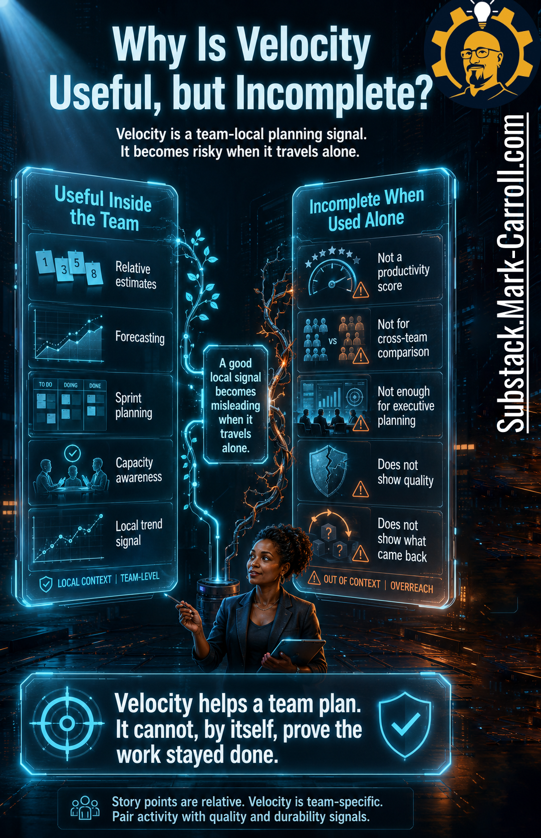
Velocity deserves a more honest defense than its loudest critics usually give it. Used locally, velocity can help a team forecast, support sprint planning, and notice whether its own delivery rhythm is changing. It can prompt useful conversations about capacity, scope, and sequencing. That is the useful part, and serious teams should not throw it away because someone online discovered a hot take and dressed it up as a principle.
The incomplete part begins when velocity leaves the team context and starts pretending to be a productivity score. Story points are relative, and velocity is team-specific. A team’s velocity is shaped by estimation habits, story slicing, domain complexity, dependencies, tooling, interrupt load, and Definition of Done. That makes velocity useful for local planning and risky for cross-team comparison. Treating velocity as a performance target, an individual score, or a cross-team comparison conflicts with the way story points are defined, which is as relative, team-specific estimates, and it invites gaming the number instead of improving the work.
That last risk has a name. Goodhart’s Law does not need a villain. It just needs a useful measure that becomes the target. When a team is rewarded for the velocity number itself, the rational moves are quiet ones: split stories into smaller points, defer the edge-case testing, lean on optimistic definitions of done. The chart climbs while the durable work slips. I am borrowing Goodhart’s Law as a lens here, not offering it as proof that velocity is doomed. It simply describes what happens to any honest signal once we point planning pressure at it.
So the key sentence is simple. Velocity helps a team plan, but velocity cannot, by itself, prove the work stayed done. That is the nuance too many metric debates lose. The argument is not that velocity is bad. The argument is that velocity is incomplete. Velocity needs witnesses. Quality, stability, flow, rework, and the people living inside the system all need to testify, because one metric should not be forced to impersonate the entire truth.
What Is the Difference Between Closure and Completion?
This is the distinction that makes the rest of the article work. Closure is administrative. Completion is operational. Closure means the ticket moved, the card crossed the board, the field changed to done, the points counted, and the report updated. Completion means the work survived real use. The feature held up, the fix did not reopen the problem, the dependency did not create a second wave, support did not inherit confusion, and the next sprint did not quietly pay the bill.
Closure is a status. Completion is a result. A story can be administratively done and operationally unresolved. This sounds simple until a team starts planning against closure while paying for incomplete work somewhere else. When that happens, the organization can sincerely believe it is moving faster while the team experiences the work as slower, heavier, and more tangled than the dashboard implies.
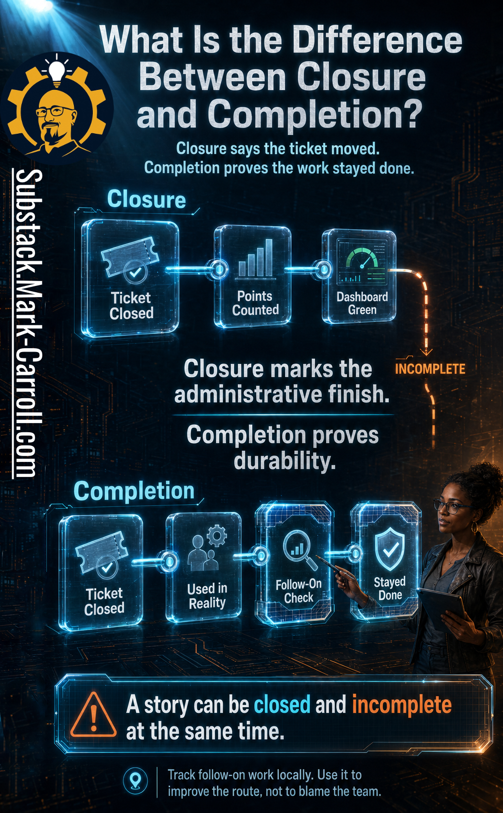
A story can be closed and incomplete at the same time. The moment it moves to done, the system records closure. The open question is whether that closure survives contact with production, customers, downstream teams, support, and the next planning cycle.
That does not mean every follow-on ticket is a failure. Some follow-on work is healthy, and iteration is how good product development actually happens. We should not punish learning or treat every change as evidence that someone messed up. The point is pattern recognition. If the same kinds of follow-on work keep appearing after the same kinds of closed stories, the route is telling us something. Maybe the Definition of Done is too weak, dependencies are discovered too late, stories are sliced around effort instead of user value, QA is under-powered, or product and engineering are closing different versions of “done.”
My hard-won opinion is that the closure-completion gap usually starts with bad slicing, not bad effort. Teams cut work into pieces that are easy to assign, estimate, and close, then ask the Definition of Done to prove value after the story has already been shaped around task completion. By then, the route is already bent.
How Much Capacity Does Rework Quietly Consume?
Rework is politically dangerous because it hides inside normal work. No one schedules a calendar event called “paying for work we already celebrated.” No dashboard adds a cheerful slide titled “capacity we thought we had but already spent.” Instead, rework disguises itself as routine. A defect here, a clarification there, a cleanup ticket too small to argue about, and a dependency fix everyone agrees is “just part of the work” can look manageable in isolation and still consume the capacity leadership counted as available.
Three local cost categories tend to surface when you trace a Rework Shadow backward. Bystander Burn is the coordination time several people spend seeing, monitoring, and half-investigating work that came back. Investigation Tax is the duplicated effort spent reconstructing why something marked done reopened. Compounding Rework is the cleanup that accumulates when today’s fixes are built on a foundation that was never confirmed, so they quietly generate tomorrow’s follow-on work. None of these show up as one giant visible failure. The team experiences them as friction, context switching, and a sprint plan that somehow always runs optimistic.
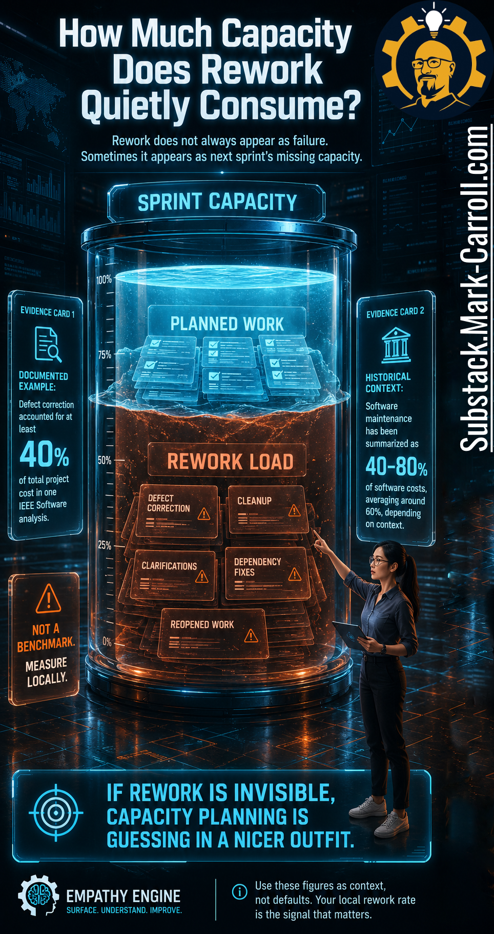
The evidence here matters, and so do the caveats. Documented examples show that defect correction and maintenance can take a substantial share of software effort and cost. One IEEE Software analysis found defect correction accounting for at least 40% of total project cost in its context. Classic work by Glass summarized maintenance as often consuming 40% to 80% of lifecycle cost, with around 60% cited as a common average in those historical studies. Those figures come from specific contexts and eras. They are best treated as a reason to look, not as a benchmark to import.
The wrong use of those numbers is to march into a QBR and announce that research says 60% of our work is maintenance, therefore we are losing some exact dollar figure. That is not analysis. That is spreadsheet cosplay with a blazer. The right use is more disciplined: this category of work can be large enough to matter, our green dashboard may not capture it, and our local version deserves measurement. The local question is not what the industry average says. The local question is how much of our recently closed work generated follow-on work, and how much capacity that follow-on work consumed.
Here is the trace I wish I had run sooner, kept simple so the shape is visible. A team closes 40 points in a sprint, and I sign off on the number with real confidence. The next sprint, that same team spends 10 points on defects from those stories, 6 on clarifications, and 4 on dependency cleanup. That is 20 of 40 points, half the apparent capacity, quietly going to work I had already counted as done. I have planned the following quarter against the 40 and felt the 20 as nothing more than a vague sense that the team was slower than the chart promised. The exact numbers will be different for your team, and this is an illustration rather than a benchmark. Use points, hours, or team-days, whichever your team already trusts, as long as you keep the unit consistent inside the local sample. The point is that the math becomes local, specific, and hard to ignore the moment someone traces it instead of trusting the total.
Here is the part the evidence cannot teach you: the first time you surface rework in a room that has been reporting green, everyone hears an accusation unless you frame the conversation with extreme care. I have personally discovered, through the glamorous leadership method known as saying it wrong first, that “we are wasting capacity” makes people defend their reputations, while “our planning signal is missing part of the route” gives them a system to inspect. Same evidence. Completely different room.
What Do DORA and SPACE Actually Tell Us About Productivity?
DORA and SPACE help here because they resist the temptation to turn one number into a religion. DORA (DevOps Research and Assessment) reminds us that delivery performance needs balance. Throughput matters, but so does stability, which is why Deployment Frequency, Lead Time for Changes, Change Failure Rate, and Mean Time to Restore belong in the conversation together, with Reliability as an important added dimension. One point needs to be explicit, because it is easy to get wrong. DORA does not define an official rework metric. Any rework signal in this article is a local planning measure inspired by DORA’s stability focus, not a DORA metric.
SPACE (Satisfaction Performance Activity Communication Efficiency and flow) makes a related point from another angle. Developer productivity is multidimensional, so activity alone cannot carry the full truth. The dimension that matters most for us is the tension between Activity, which is where velocity and story points live, and Efficiency and Flow, where rework and friction show up. Satisfaction belongs in the picture too, because constant firefighting is how good teams burn out while the activity numbers still look fine.
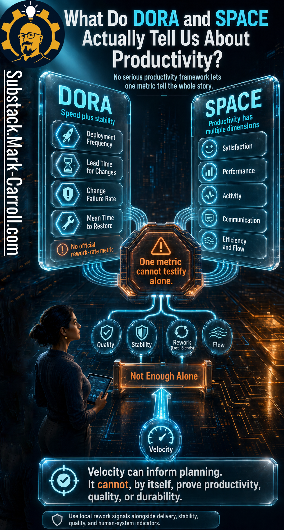
This matters because a tired metrics culture often tries to fix one over-promoted number by inventing another over-promoted number. That is not maturity. That is metric whack-a-mole with better fonts. My read is that teams keep reaching for one over-promoted number because uncertainty is socially expensive. A single metric gives everyone something to point at, defend, and repeat in a meeting, even when everyone quietly knows the work is more complicated than the number can carry. The goal is not to replace velocity with a rework rate as the new single truth. A local rework signal earns its place because it adds a missing dimension. It should sit beside velocity, quality, stability, and flow, and it should tell us whether apparent progress carried a hidden durability cost. No serious productivity framework lets one metric tell the whole story, whether that metric is velocity, rework, deployment frequency, or anything else we decide to worship during a quarterly ritual. The goal is not a bigger scoreboard. The goal is better judgment.
How Can a Team Check Whether “Done” Stayed Done?
The good news is that seeing the Rework Shadow does not require a transformation program. A team does not need perfect tracker hygiene, a new governance office, or a vendor platform that looks like mission control for a moon landing. A team can begin with a lightweight check. I call it the Five-Story Field Test.
Pick five recently closed stories. Set a local analysis window. Look for follow-on work. Link what came back. Estimate the capacity impact. Bring the pattern into planning. That is enough to start learning, and learning is the point. The goal is not courtroom precision. The goal is planning honesty.
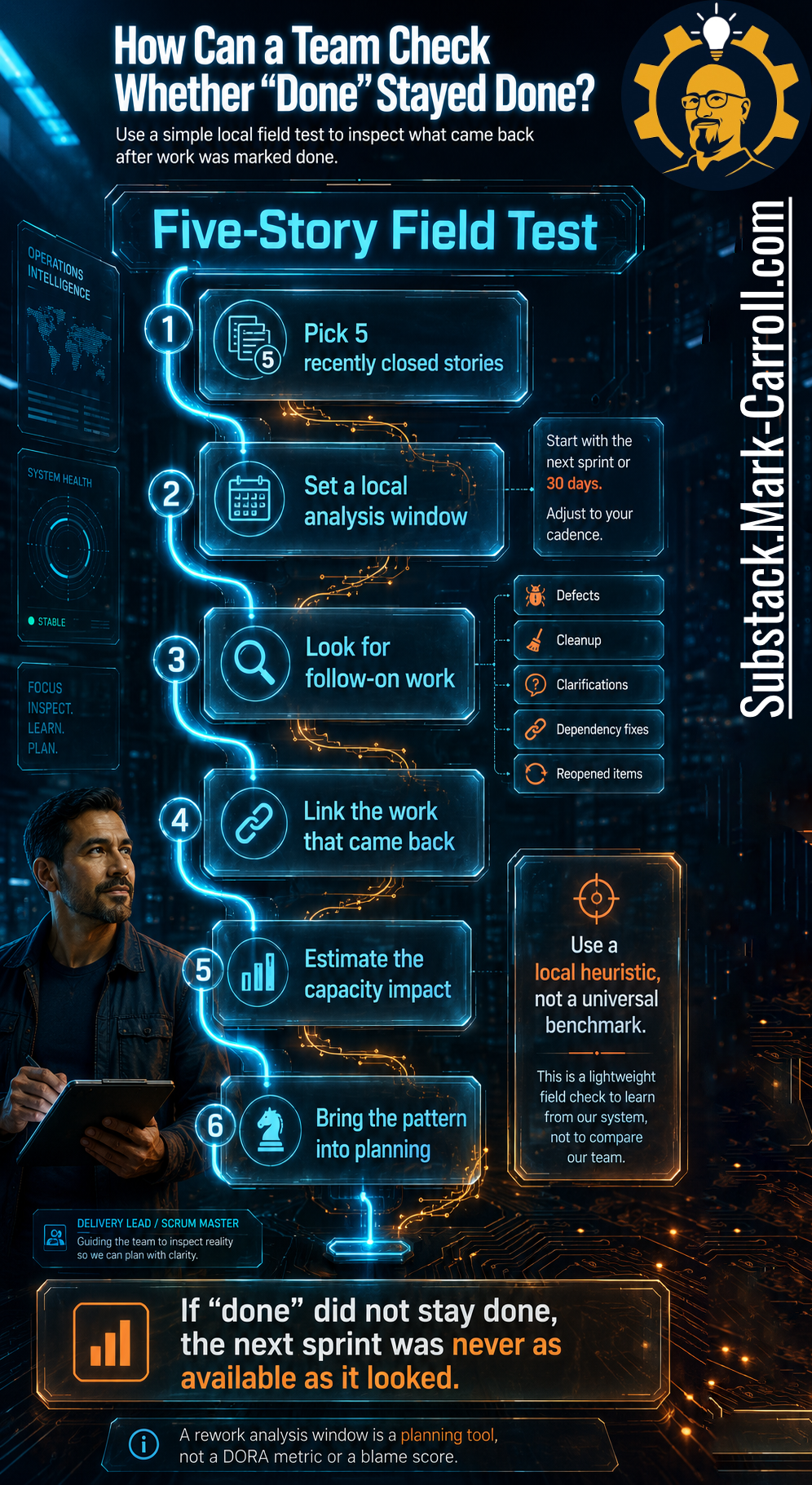
The phrase “local analysis window” carries weight. Thirty days can be a useful starting point, but so can the next sprint or the next release window. The right window depends on the team’s cadence, release rhythm, support pattern, and product context. Thirty days is not magic, not an industry standard, and not a moral law. It is a practical lens, and you should tune it to the way your team actually ships.
Then ask the plain questions. Which stories were marked done? Which generated follow-on work? What kind of follow-on work appeared? Was it linked back to the original story? How much capacity did it consume? A rough local signal can still improve the conversation. If five recently closed stories produced three follow-on items that ate meaningful time, the team does not need a philosophical debate about whether velocity is good or bad. The team needs to ask what the route is missing.
What Is the Better Route From Velocity to Real Progress?
The broken route is familiar because many organizations have normalized it. Story closed, points counted, velocity rises, dashboard turns green, leadership plans against the green dashboard, and rework appears somewhere else. The route feels efficient because the signal moves quickly upward. The problem is that the signal is under-instrumented. It carries closure but not durability, activity but not the cost of work returning through another door.
The better route adds a few checks before confidence hardens. Story closed, follow-on window checked, rework linked, local rework rate estimated, capacity adjusted, and planning confidence corrected. That route takes slightly longer, which is the point, not a weakness. Speed without correction just produces prettier mistakes.
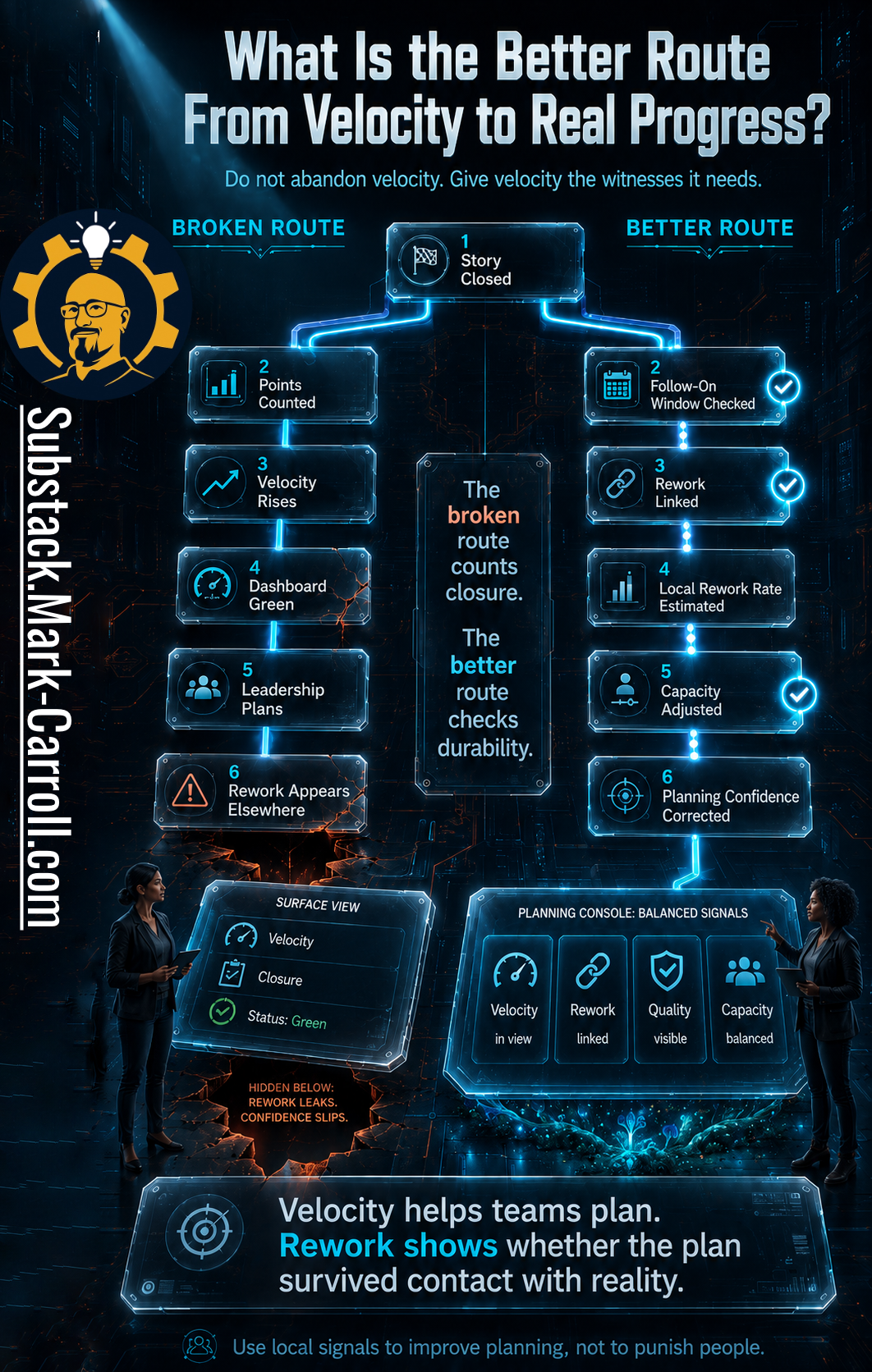
The better route does not abandon velocity. It gives velocity witnesses. Velocity can stay in the room. It just cannot testify alone.
This is where the Rework Cost Calculator comes in. Subscribers received the Rework Cost Calculator in Monday’s Leader’s Dispatch. It turns your team’s local rework observations into a rough-order estimate of capacity and cost impact you can bring to the next QBR, so you are not planning against capacity the Rework Shadow already spent.

The phrase “rough-order” matters, and so do the guardrails. The calculator uses your own local inputs, with no baked-in industry benchmarks. It is not an accounting statement, an ROI guarantee, or an official DORA metric. It is explicitly not a tool for ranking individuals or teams. If you turn it into a leaderboard, you will recreate the exact metric theater this episode exists to avoid. It is a planning tool. It helps leaders ask better questions: how much recently closed work came back, how much capacity follow-on work consumed, how planning assumptions should change, and where the route needs repair.
That is the work. Not blaming people, not worshiping metrics, and not pretending every green dashboard is a lie. The work is to build a route where progress can survive scrutiny. A healthier route does not only ask how much work closed. It asks what stayed closed. Velocity tells you whether work moved, rework tells you whether some of that movement came back, quality tells you whether the work held, and capacity tells you what the team can honestly promise next. Planning confidence improves when those signals travel together. A green dashboard is not the problem. A green dashboard without witnesses is.

This is one reason I keep writing Collaborate Better: because the closure-completion gap is not just a metrics problem. It is a collaboration problem where people keep inheriting the cost of work that the system has already congratulated itself for finishing. Better collaboration is not softer language or more cheerful meetings. It is the discipline of making work, ownership, decisions, and durability visible enough for people to act on them together. You can learn more at CollaborateBetter.us.
Next in Route Rebuilder: Part 5, The Route That Outsourced Judgment to the Tool, where an AI recommendation becomes a decision without anyone deciding.
Next:

P.S. Pull the last five closed stories from your board. Ask how many stayed done thirty days later, and what the rework actually cost. Reply and tell me what you found. I read every one.
Regards,
Mark 👋
Evidence note
The cost figures in this article are illustrative and context-specific, not benchmarks. The 40% figure comes from a single IEEE Software analysis of defect correction in its own project context. The 40% to 80% maintenance range, averaging around 60%, comes from Glass’s historical synthesis of earlier studies and should be read as a reason to measure locally, not as a current standard. DORA defines four core metrics (Deployment Frequency, Lead Time for Changes, Change Failure Rate, and Mean Time to Restore) plus Reliability, and does not define an official rework metric; any rework signal here is a local planning measure. SPACE is used only to support the multidimensional argument, not to endorse any specific metric or tool. Goodhart’s Law is used as a descriptive lens, not as proof. All rework rates and costs are local; compute your own.

Previous:
The Route That Trained Override Behavior

The quarterly architecture review is twenty minutes in when the process diagram goes up on the screen. Maya has seen this slide before. Every new service flows left to right across it: request, requirements, design, and then the box in the middle that makes everyone feel safe, the security and architecture review. The arrow runs straight through it, the…
More Content to Discover:

Half Your Team Is Using AI. You Don't Know Which Half.

Intro If you read the piece we published last week on Leadership in Change, you saw the structural diagnosis: mandate pressure, decision collapse, intake collapse. Three failures that sit underneath almost every AI pilot that goes sideways. That piece mapped the architecture. What it did not cover is what happens on the human side of the same problem, wh…

The dangerous dashboard is not the one that turns red.
The dangerous dashboard is the one that stays green while last sprint’s work quietly returns through defects, clarifications, support tickets, cleanup, and dependency fixes.
That is why this piece is not really about velocity. It is about the question every Agile team should ask before the next QBR: what actually stayed done?