A Count Isn’t a Verdict
Plain-English premise: An AI usage dashboard can accurately show that people used the tool. By itself, it can’t show that the work got better.
Judgment Seat: The manager about to attach a usage number to a person, a team, a review, or a claim that the rollout worked.
Episode 1:

Episode 2:

👋 Last week’s closing promised an episode called The Scoreboard Is Lying. The research changed my mind again. The dashboards in this research weren’t lying. The ones whose definitions I could inspect were counting exactly what they were built to count. The trouble starts when we ask a count to testify about something it never observed. Episode One budgeted the reviewer’s attention. Episode Two asked what the sender owes before review begins. Episode Three asked what an approval can prove. This week moves up a level, to the number leaders reach for when they want to know whether any of it is working.
Episode 3:


Research Binder: the receipts (citations + source notes) are compiled in a PDF at the bottom of this post.
Empathy Engine is a reader-supported publication. To receive new posts and support my work, consider becoming a free or paid subscriber.
⚡ Pressure
AI usage is easy to count, and the count can quietly become the verdict on the work.
🎯 Payoff
This issue gives you the AI Proxy Audit: four questions to ask before a usage number becomes a verdict about people or progress.
Pressure Moment
In an April 2025 memo, Duolingo announced that AI use would be part of what it evaluated in performance reviews. In an interview published April 10, 2026, CEO Luis von Ahn said the company had backtracked. He said he didn’t know whether employees were using AI just to be seen using it. What he recounted was their question: “Do you just want us to use AI for AI’s sake?” His answer, in effect, was that the company had been pushing something that sometimes didn’t fit instead of holding people accountable for the outcome.
That’s one company, in its CEO’s account. No scored review field or effective date is in the public record. The employees weren’t asking whether AI mattered. They were asking what their use of it was supposed to prove.
I’ve had the experience of looking at completed work in Azure DevOps and then watching the same work return as follow-on tickets. The original story was still closed. The velocity was still real. The points had still been delivered. But the dashboard had stopped observing before the consequences did. That changed how I read activity metrics. The number can be perfectly accurate about what happened inside its measurement boundary and still be insufficient evidence that the work itself improved.
The Number Gets Promoted
An AI dashboard might accurately report how many people opened the tool this month, how many prompts were recorded, and how many suggestions were accepted. Those can be perfectly legitimate observations. Then someone carries the number into another room: the boardroom, the performance review, the transformation update, the compensation conversation. Somewhere along the way, an activity count acquires a promotion. It stops being evidence that the tool was used and starts standing in for evidence that the work improved.
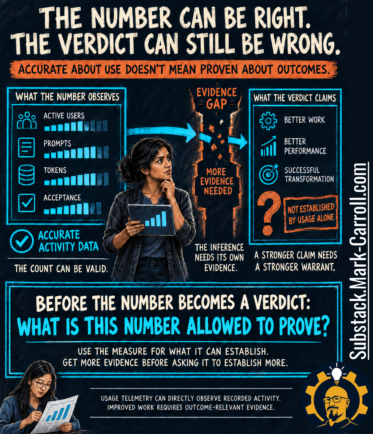
That headline is deliberately provocative, so it’s worth being precise about it. An unsupported verdict can still turn out to be correct. What an accurate activity count can’t do is establish the stronger conclusion on its own. The gap between the two isn’t a flaw in the data. It’s an inference, and an inference needs its own evidence.
So the question this episode keeps returning to is easy to ask and harder to answer: What is this number allowed to prove? It’s the question underneath the whole series, applied one level up. Episodes One through Three asked who could actually defend a deck, a handoff, or an approval. This week, what needs defending is the conclusion someone draws from a number.
Four Kinds of Evidence on One Screen
Not every number on an AI dashboard belongs to the same evidentiary category. Some observe activity, some are estimates built on assumptions, some are perceptions users report, and some measure downstream work. Arranged in matching tiles, they look alike. The activity indicators, at least, are defined in public. Microsoft’s Copilot Dashboard documentation counts active users from recorded Copilot activity, and GitHub’s documentation calculates acceptance rate from counts of suggestions generated and accepted. Neither definition assesses whether the work that followed was any good. That isn’t a hidden flaw. It’s what those measures are for.
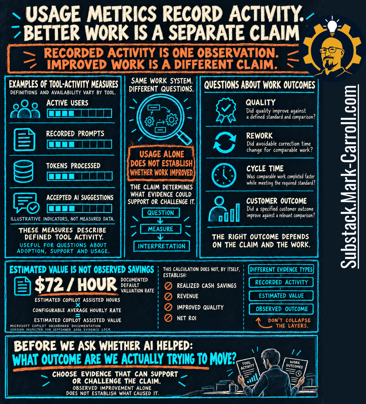
Estimates are where a number gets most persuasive. Microsoft’s dashboard also shows an estimated assisted value: estimated Copilot-assisted hours multiplied by a configurable hourly rate, with a documented default of $72 an hour. Change the rate and the dollar figure moves while nothing about the work does. That makes it a modeling input, not observed savings, and on its own it doesn’t establish realized cash savings, revenue, improved quality, or net ROI (Microsoft Copilot Dashboard documentation, as inspected September 2026).
Once the claim changes, the evidence question changes with it. “Did people use the tool?” is one question. “Did avoidable rework decline for comparable work?” is another, and “Did AI cause that decline?” is harder still. Moving between them isn’t a climb from bad data to good data. It’s a move between different claims, which is why the useful question about an AI metric isn’t whether it’s good. It’s good for what?
Sometimes Usage Is Exactly the Right Thing to Measure
There’s a lazy version of this argument that calls every usage metric a vanity metric. I don’t buy it. Organizations spend real money on AI tools, and leaders have a legitimate reason to know who has access, who started, who stopped, and where people are getting stuck. For those questions, usage data isn’t a weak proxy. It’s the right evidence.
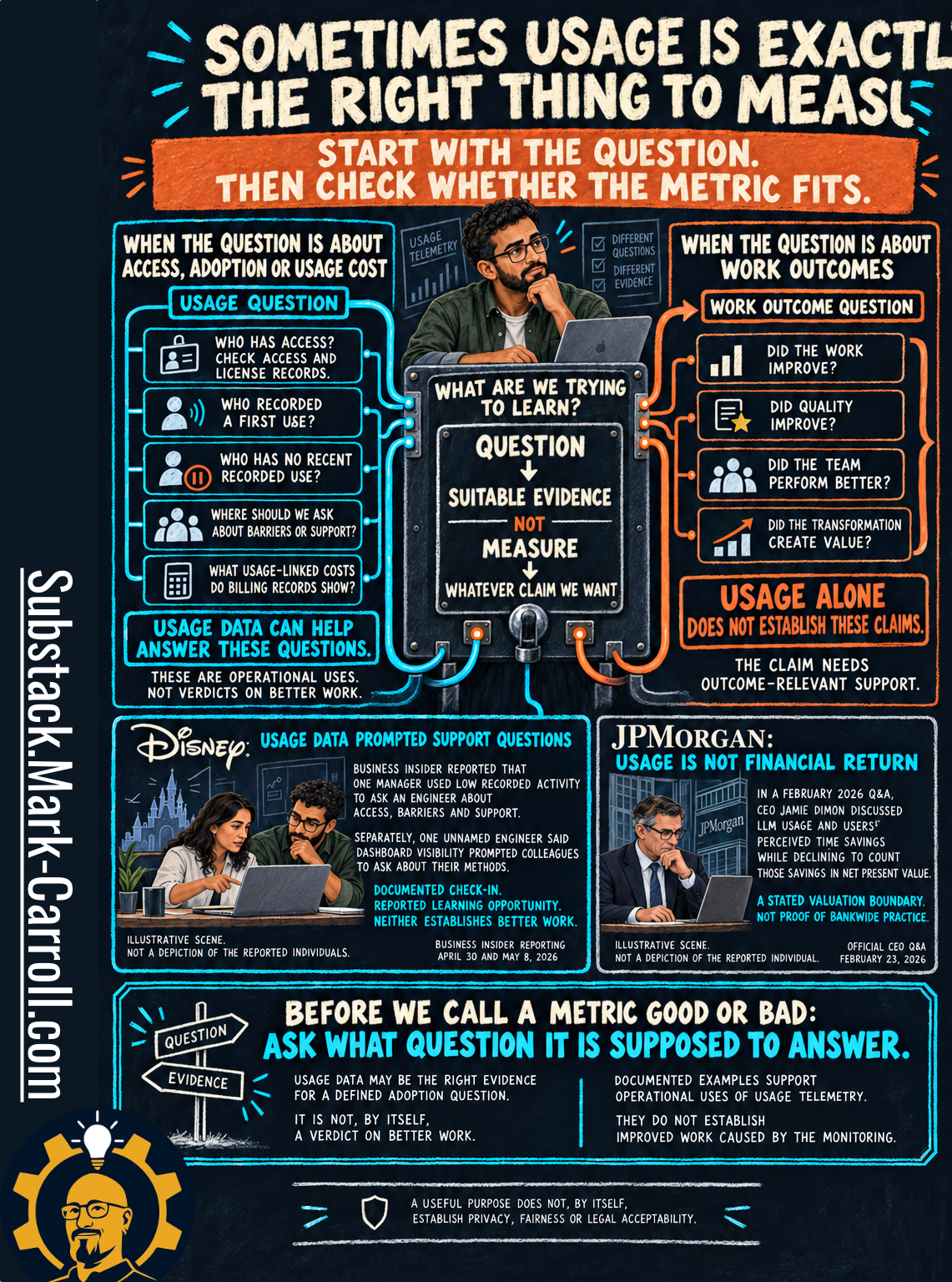
Disney offers a documented example. Business Insider inspected a manager’s message to an engineer whose recorded AI use was low; the note asked about tool access, barriers, and what support would help. Separately, an unnamed Disney engineer said colleagues saw their name near the top of an internal usage dashboard and reached out to learn their methods. Other Disney employees described pressure around the same dashboard, so this is a documented check-in and a reported learning opportunity, not a verdict on the dashboard (Business Insider, April 30 and May 8, 2026).
JPMorganChase shows the same boundary drawn from the top. In the bank’s official February 23, 2026 Q&A, CEO Jamie Dimon discussed LLM usage and the time savings users perceive, while declining to count some of those savings as financial return: “That’s not in an NPV.” That’s a stated valuation boundary, not proof of bankwide practice. Business Insider’s April 2026 reporting on internal dashboards that track and rank engineers’ AI use belongs in the same picture, along with the bank’s statement that the data isn’t used in performance management and employee accounts of feeling pressure anyway.
None of this shows that monitoring improved anyone’s work, and a useful purpose doesn’t by itself settle privacy, fairness, or legal acceptability. What it shows is usage data doing the job usage data can do. A metric doesn’t become foolish when we change the question. It becomes insufficient when we ask it to answer a question beyond the support we have for that use.
When the Number Enters a Review
Usage information doesn’t become dangerous because someone places it near a review. The question changes. An adoption question asks whether people are trying the tool. A performance question asks what their usage says about whether they’re doing the job well, and that second question carries a much larger interpretive burden.
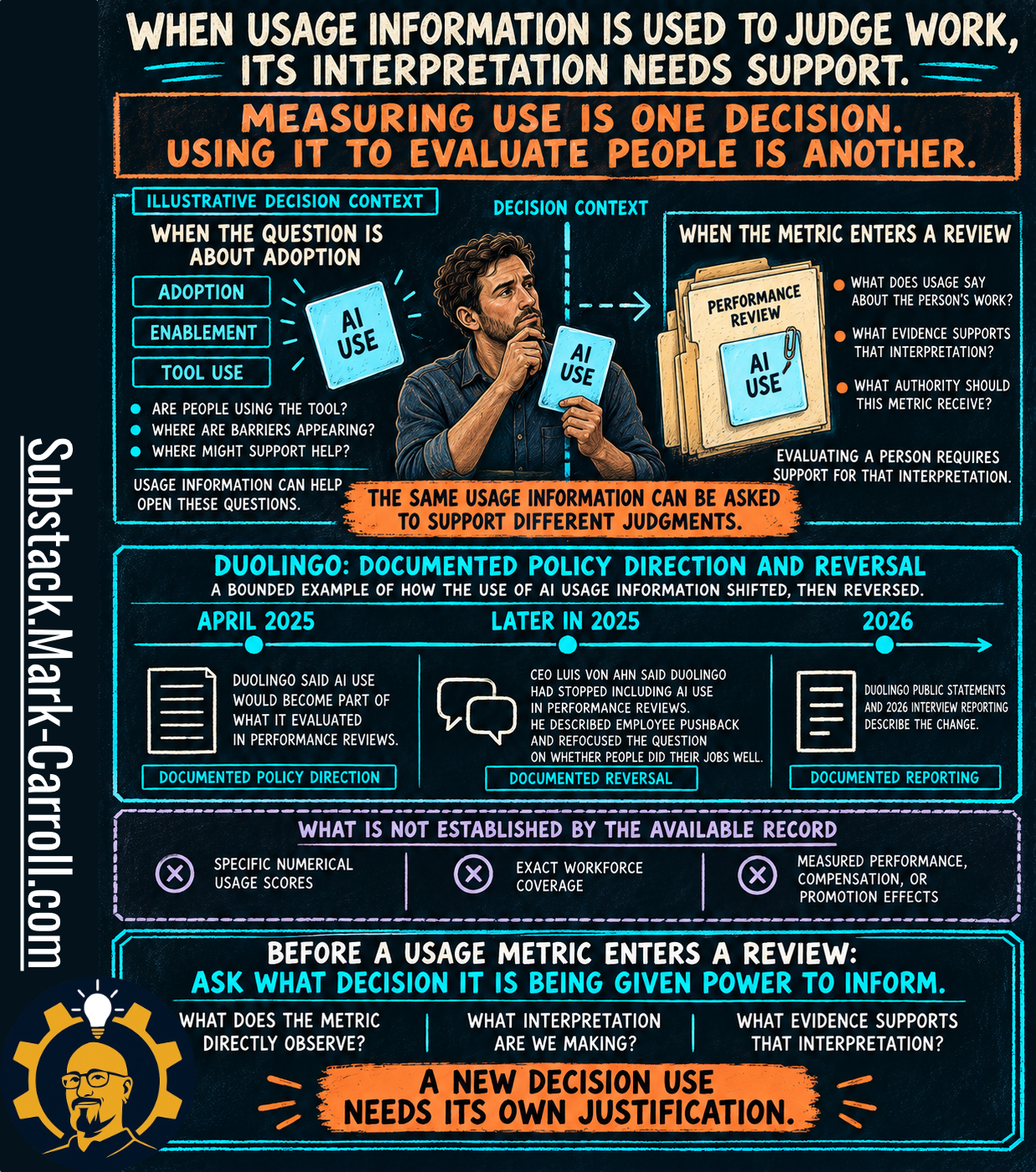
Duolingo is the clearest public example of that shift, and its limits matter as much as its story. The memo announced AI use as an evaluation factor; the CEO’s later account describes backing away from it at a point he didn’t date. The record doesn’t establish a numerical usage score, exact workforce coverage, or any measured effect on performance, pay, or promotion.
Amazon supplies a narrower example. By May 29, 2026, Amazon had confirmed that KiroRank, an informal, employee-built AI-usage leaderboard, had been deprecated, describing it as a beta tool used by some employees rather than a formal or approved one. Reporting credited to the Financial Times quoted senior vice president Dave Treadwell telling staff, “Please don’t use AI just for the sake of using AI.” The explanations for the shutdown differ: 404 Media reported an internal announcement saying the goal had been accomplished, alongside employee accounts pointing to waste and gaming. The reporting doesn’t settle which was the real reason, and I won’t pretend it does. Amazon did tell Fortune that it discouraged measuring developer productivity through token utilization, while treating token monitoring for cost and efficiency as a separate matter.
KiroRank wasn’t a performance review, and that’s the point. Metrics don’t sit on a dashboard waiting to be read; organizations decide what they’re allowed to influence. A number can prompt curiosity, inform coaching, enter an evaluation, or move money. Those are different decisions, and they don’t automatically inherit the same evidentiary permission. A new decision use needs its own justification.
A Million Prompts
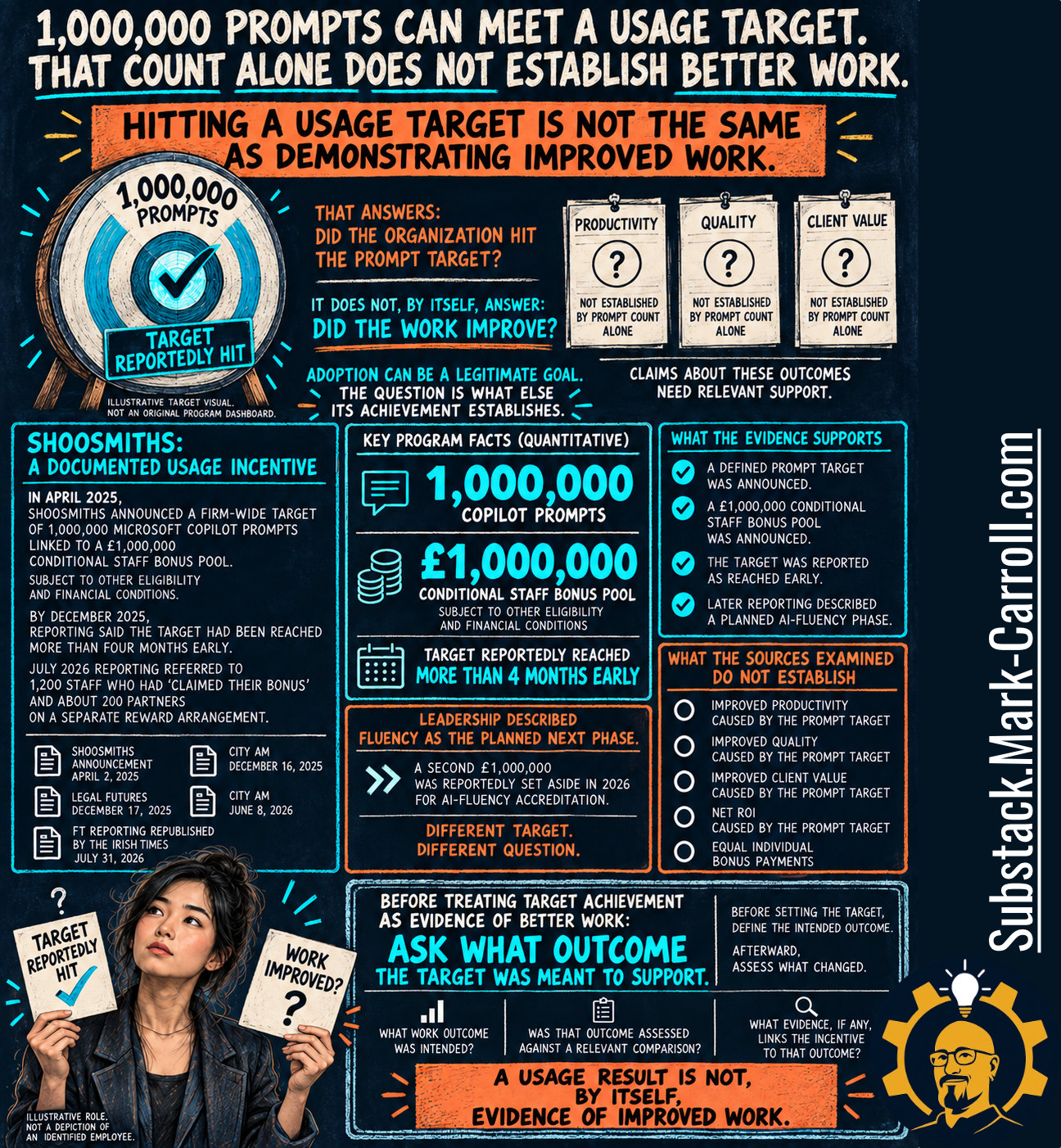
Shoosmiths is the best-documented case in this research, and it isn’t a failure story. That’s what makes it a fair test of the argument: here, adoption was the explicit goal.