
The Green Dashboard Trap
Profit With Proof | Episode 3

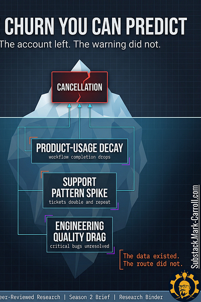
The Churn You Can Predict
The warning was in the workflow weeks before the account was gone.
Your organization stored it as separate local facts.
👋 Welcome to this week’s edition of Empathy Engine. Every Tuesday, I publish a new article for paid subscribers first, then unlock the full piece for everyone late Thursday morning. Each week, I turn product leadership friction into practical tools, sharper language, and more defensible decisions.
IF YOU ARE SKIMMING
Read three sections: Which Signals Earn Room on the Page, What the Evidence Actually
Lets Us Price, and What Leaders Should Do Next. That is the operational spine.
TL;DR
› Churn is a sequence, not a surprise. The warning shows up in workflow behavior weeks before revenue ever sees it.
› Price one account locally; skip borrowed benchmarks.
› The scorecard is a review ritual, not a churn oracle.
› Most available churn frameworks stop at lagging indicators. The earlier signals are already in your systems. They just never get read together in time.
Most available frameworks for churn stop at lagging indicators; CRM summaries, ticket closure rates, broad satisfaction scores. What CS directors, PMs, and engineering leads consistently report missing is a way to read the earlier signals already in their own systems, assembled into a shared risk picture in time to act. That is the exact gap this article and the paid Churn Signal Scorecard address.
What this article does and does not claim
Does: give leaders a diagnostic framework for reading earlier churn risk across functions, plus a local pricing structure they can carry into a review.
Does not: claim a universal B2B SaaS churn benchmark, guaranteed ROI, or perfect prediction from a one-page scorecard.
Research receipts, citations, and source notes are compiled in a PDF at the bottom of this article.
Previous article in this series: Episode 2 (The Escalation Delay Cost)

The route that never announced itself
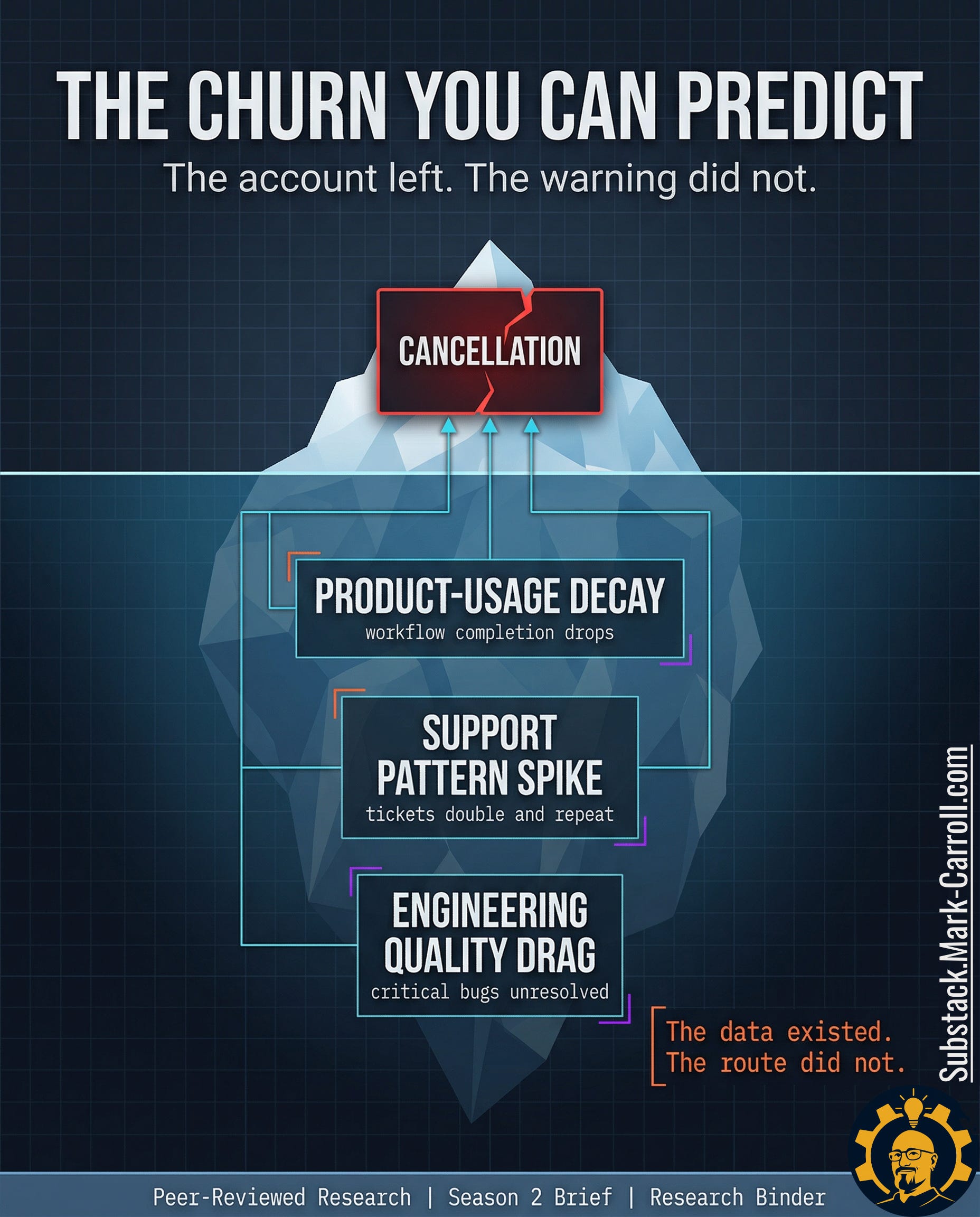
A customer success manager opens the record of a churned enterprise account. The cancellation note is two sentences long and professionally vague. The product was no longer meeting expectations. The timing no longer worked. Nothing in the note is false. Nothing in it is useful. It reads like the final line of a story the system had been telling for weeks in a language nobody was paid to assemble.
Then the ticket history starts talking.
Support volume had doubled in the eight weeks before cancellation. The account was not generating one dramatic flare-up. It was generating a pattern. The same pain points kept resurfacing under slightly different labels. One complaint became a thread. The thread became a loop. The loop became normal enough to survive the scroll test inside the queue.
Product had its own version of the same warning. Three feature requests tied to the account had been sitting in backlog limbo for months; not rejected, not prioritized, not resolved. Just old enough to become furniture. Engineering had another version. Two critical bugs had been closed as duplicate without restoring the customer’s actual experience. The system recorded closure. The customer kept living inside the defect.
That is the dangerous part. Every team could point to a clean local story. Support could say the tickets were handled. Product could say the requests were still under review. Engineering could say the bugs were already dispositioned. Revenue was the only function forced to read the whole pattern at once and revenue did not read it until the account was already gone.
Every signal existed. Nobody was reading the system as a churn predictor.
The account did not leave suddenly. The organization noticed separately.
The customer did not leave suddenly
Most teams still talk about churn as a customer event. The renewal falls through. The cancellation email arrives. Revenue records the loss. Leadership asks what changed. That framing feels natural because the ending is the part that shows up cleanly in the reporting. The damage becomes visible in a format the business already knows how to read.
The framing is wrong.
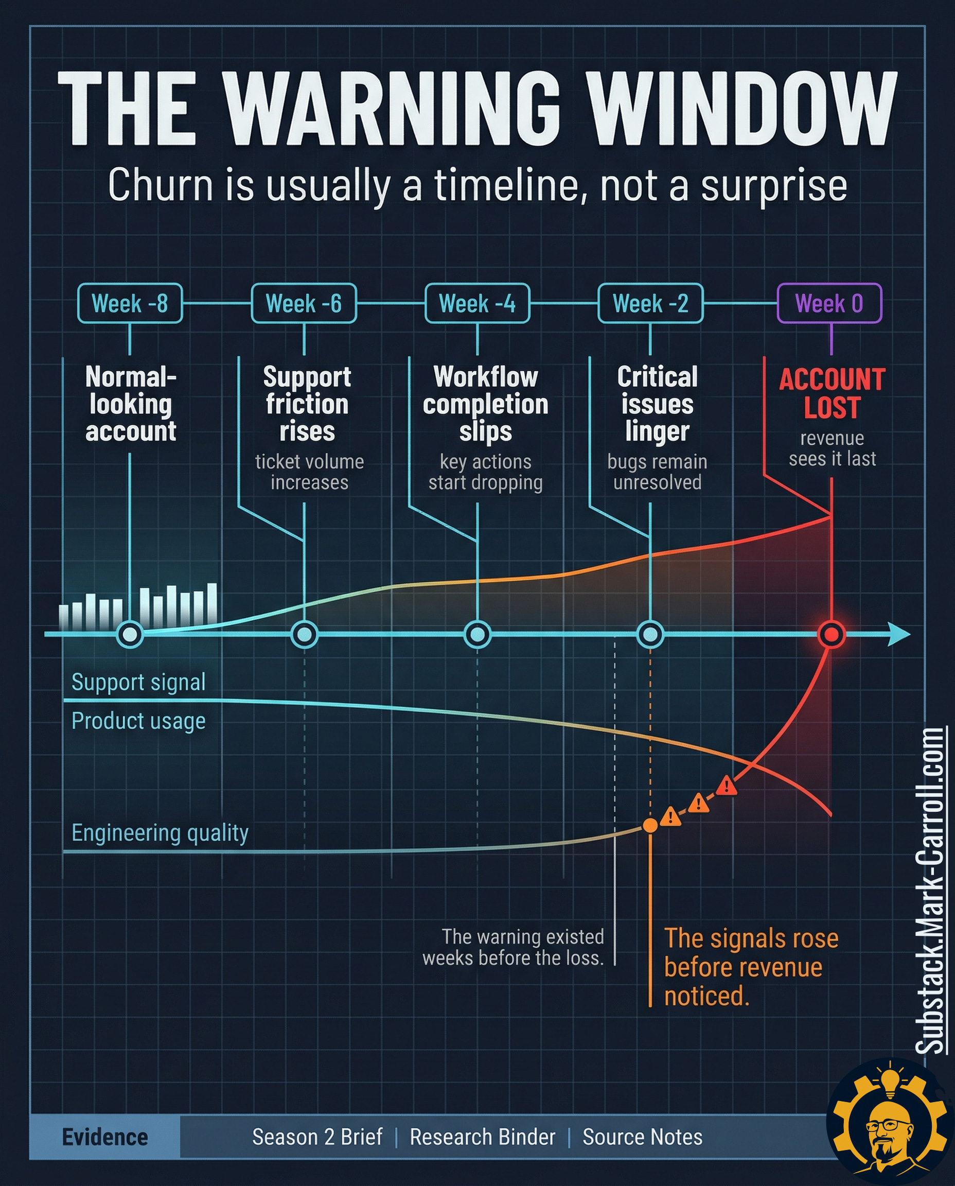
Churn is often not a moment. Churn is a sequence. The account begins weakening long before revenue calls the outcome final. A team sees more support friction. Another sees workflow completion start to slip. A third sees quality issues linger just long enough to become normal. None of those signals looks dramatic in isolation. Together, they form a warning window the organization keeps storing as separate local facts.
That distinction matters because a customer event suggests suddenness and suddenness suggests there was nothing to catch. An operating sequence suggests lead time, and lead time suggests the warning could have been surfaced, interpreted, and escalated while the account was still recoverable. The difference between those two frames is the difference between a postmortem and a review ritual.
The visible cancellation is late evidence. The real warning often forms lower in the workflow. Where ticket patterns change before the relationship language changes, where usage depth starts shrinking before the renewal conversation gets tense, and where unresolved defects keep taxing the customer after the dashboard still says things are broadly fine. Revenue sees the end of that chain. Revenue rarely sees the chain while it is forming.
In the accounts I have studied and in analogous subscription contexts, that warning window often opens six to eight weeks before revenue records the loss. That is not a universal law. It is a pattern that shows up consistently enough to be worth building a review ritual around.
That is why this article does not start with churn as a revenue mystery. Churn is usually not a mystery by the time finance records it. Churn is a sequence of operational signals that nobody assembled into a shared risk picture soon enough to matter.
The dashboard looked healthy because it was watching the wrong layer
Health dashboards, account summaries, and executive rollups do useful work. They give leadership a readable picture. They reduce noise. That is not fake value. A room full of leaders does need some form of compressed visibility or every review turns into raw telemetry theater with nicer fonts.
But that only gets you to surface condition.
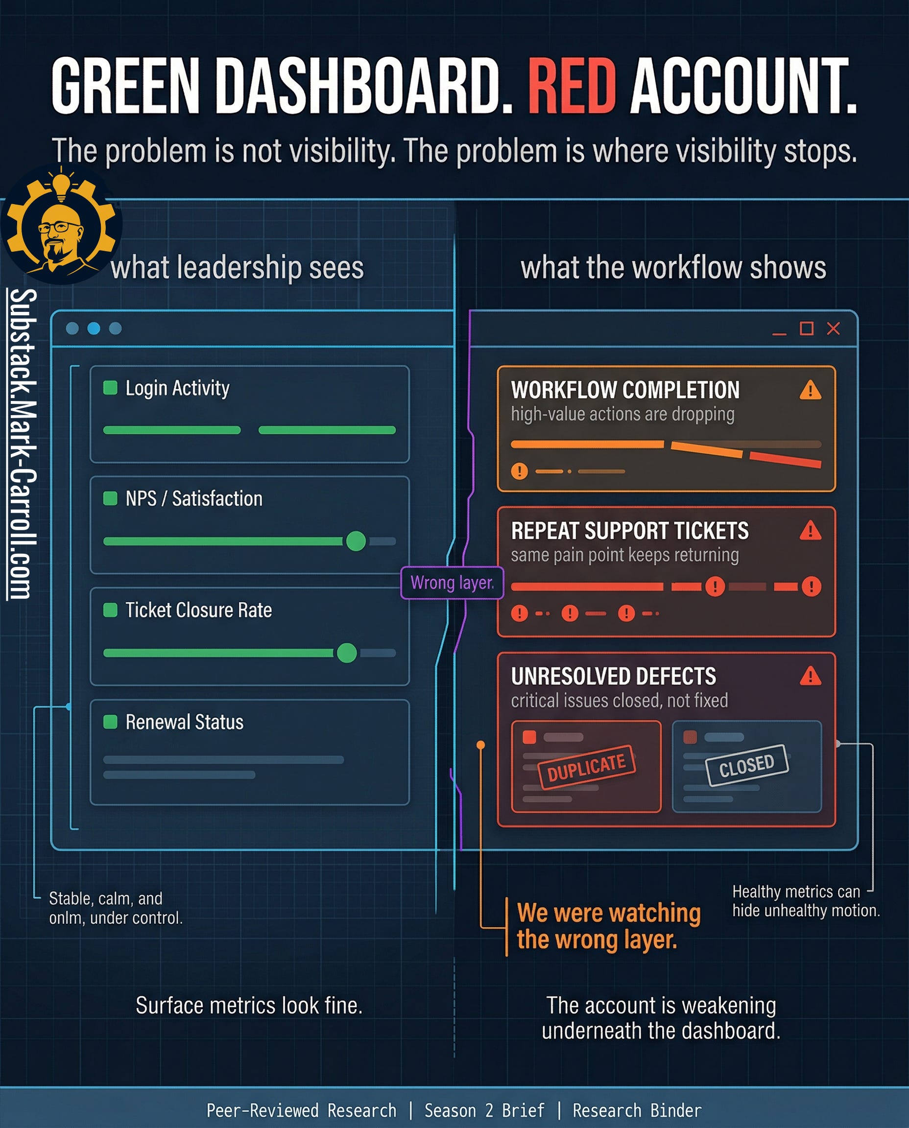
The account was not weakening at the surface first. It was weakening lower in the workflow. Where the customer’s actual path through the product was becoming less stable, less complete, and more expensive to maintain. High-value actions started dropping before the relationship language changed. Repeat support pain points started clustering before anyone wanted to call the account unhealthy. Critical defects stayed operationally alive after they looked administratively closed. The summary layer kept reporting something broadly reassuring because the damage was forming underneath the layer built to calm the room.
The problem is not health scores in theory. The problem is shallow implementation. Most account health systems are built to summarize condition, not expose deterioration in the customer’s actual working experience. They watch logins, ticket closure, broad sentiment, and milestone status because those fields are easy to report. What they often miss is the pattern underneath. A customer can still log in while abandoning the workflows that actually matter. A ticket can still close while the same pain point returns in a new costume. A bug can leave the queue while staying alive in the customer’s day. The dashboard is not lying. It is reporting from a layer that is too high to catch the shape of the failure early enough.
The account can look green right up until it turns red all at once. Not because the customer changed overnight, but because the organization built a visibility system that treats late-stage summary as if it were early warning.
Every team had a metric. Nobody owned the route.
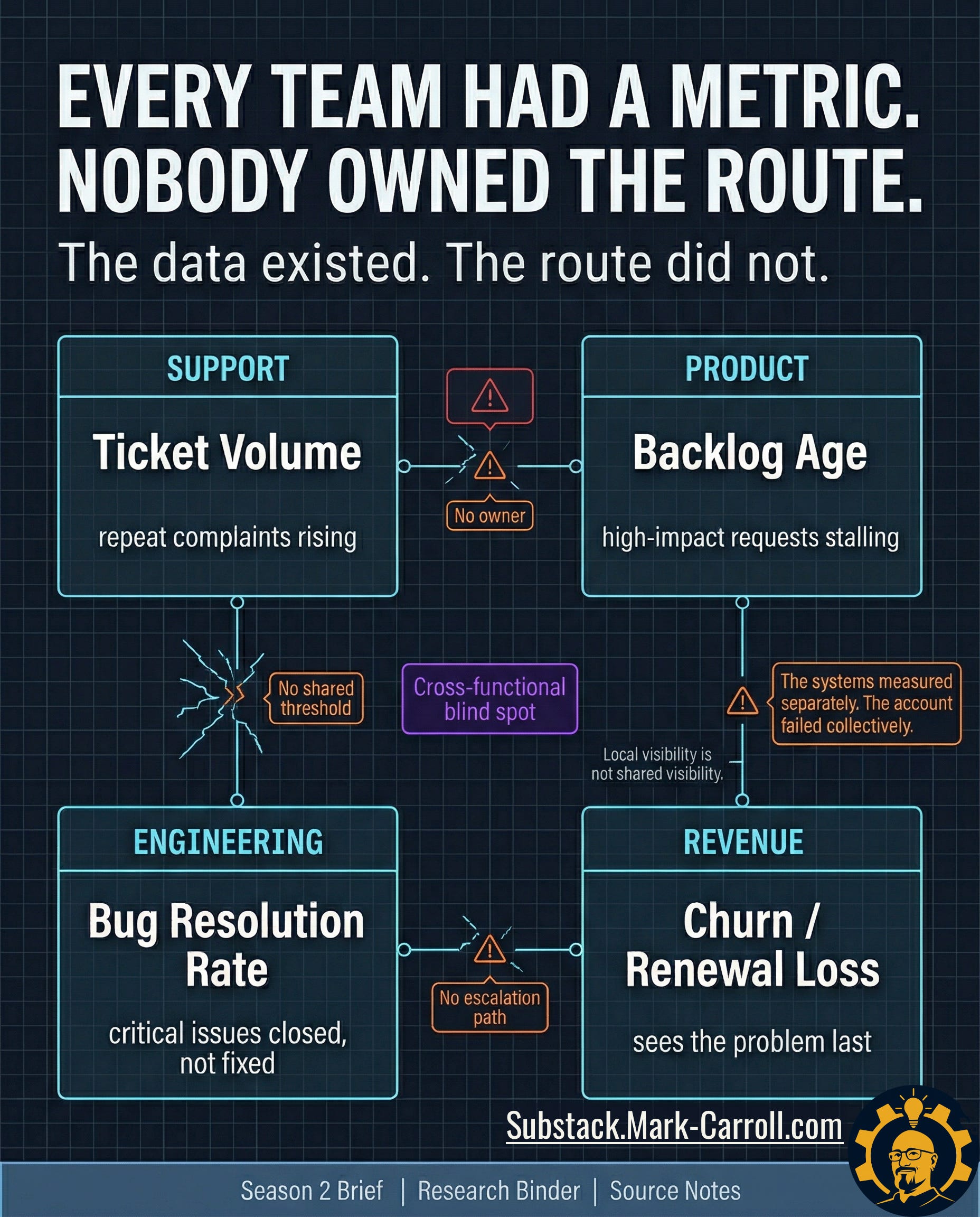
Support did not think it was looking at churn. Support thought it was looking at support. Ticket volume rose. Repeat complaints started clustering. The same pain returned under slightly different labels, which made each individual case look manageable even as the pattern grew harder to ignore. From inside the queue, the account looked noisy, frustrated, and expensive. The work still felt local. Nothing in that view required support to call the account a revenue risk.
Product heard the same account differently. Product saw backlog age, unresolved requests, and priority decisions that kept slipping because other work kept winning the room. A request can be important without becoming urgent. A customer can be loud without becoming decisive. From the product seat, the account did not look lost. It looked deferred.
Engineering had its own coherent version of the truth: defect status, duplicate closes, queue pressure, and quality tradeoffs that made sense inside the logic of triage. A bug can be closed administratively while the customer still lives inside the failure operationally. A duplicate can reduce queue clutter without restoring trust. From inside engineering, the account appeared as quality drag with a finite queue and too many competing demands.
Revenue saw the same account last, and saw it all at once. Support had the friction. Product had the delay. Engineering had the unresolved cost. Revenue got the obituary.
None of this means the people in those functions were careless. It means they were each doing their jobs inside systems that rewarded local handling and delayed shared recognition. Customer Success was managing pain. Product was absorbing tradeoffs. Engineering was triaging finite capacity. The scorecard is not an audit of their failure. It is a mechanism to stop forcing exhausted teams to fight the same fire in isolation.
That is the structural break. The organization did not fail because nobody was measuring anything. It failed because each function was measuring locally and nobody owned the route between those measurements. Support had no shared threshold that turned repeated pain into account risk. Product had no common trigger that turned backlog age into renewal exposure. Engineering had no clean escalation path that translated unresolved quality drag into commercial urgency. Every team had a valid metric. No team owned the combination.
The data existed. The route did not.
Which signals actually earn room on the page
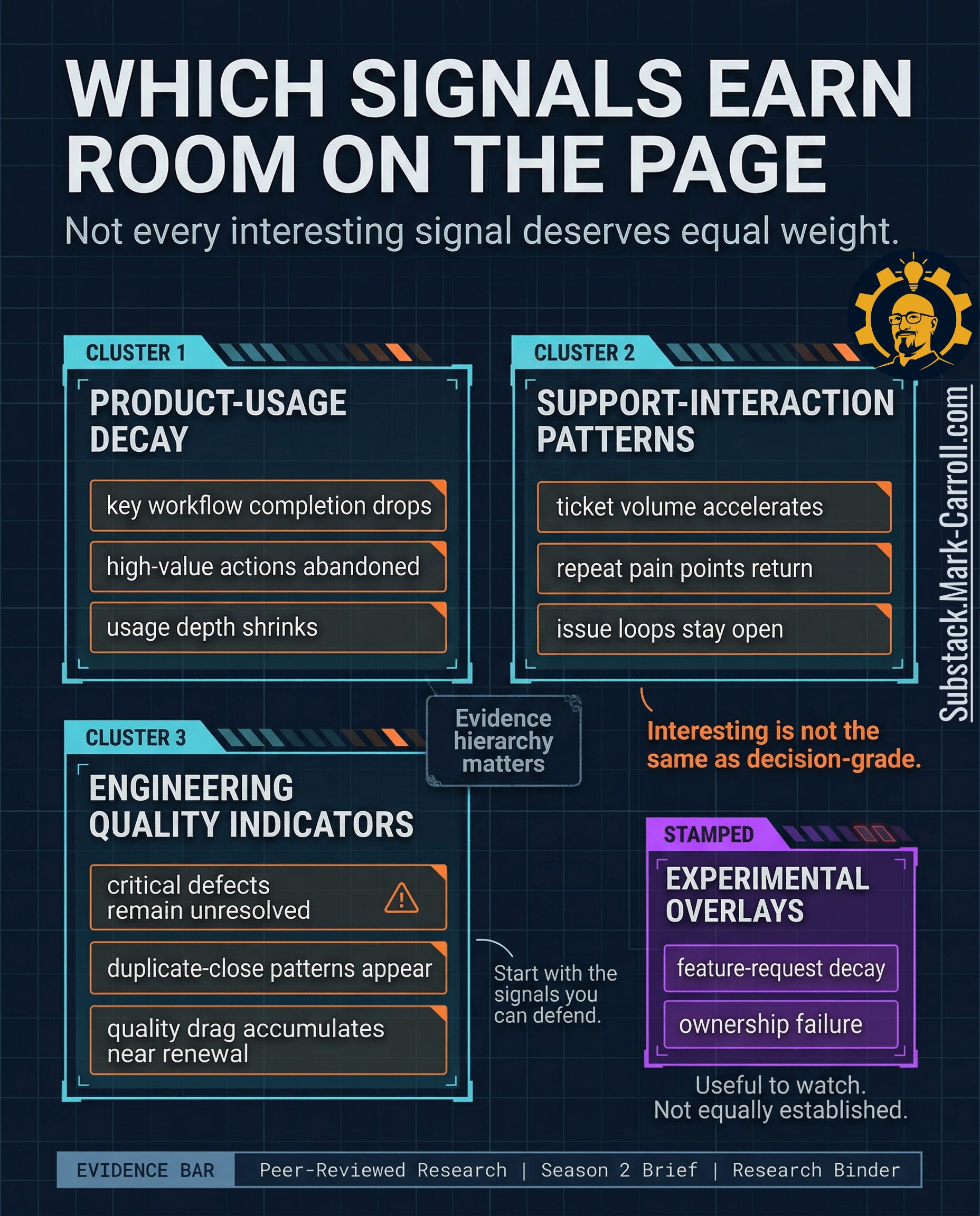
Once teams realize churn leaves workflow evidence, the temptation is to track everything. More product events. More ticket states. More defect labels. More tags, overlays, dashboard tiles, scoring logic. That instinct sounds rigorous because it looks like seriousness. In practice, it produces clutter. A scorecard that tries to honor every plausible warning ends up doing the opposite of what leaders need under pressure. It creates the appearance of completeness while making judgment slower, murkier, and easier to argue with.
Read that again.
Three signal families earn room first. Across subscription and app-churn research, declines in usage depth, repeated interaction problems, and unresolved quality issues consistently surface earlier than billing changes or broad sentiment measures. These are not the only signals that matter. They are the ones with the most consistent lead time. Which is what earns them authority in the room.
Product-usage decay
Belongs on the page because it tells you whether the customer is still completing the workflows that make the account economically real. A customer can keep logging in long after the relationship has started thinning. Completion drops, abandoned high-value actions, and shrinking usage depth tell a harder truth: they show the work the customer is no longer finishing.
Support-interaction patterns
Belong on the page because repeat pain is rarely random. Ticket acceleration, recurring complaint loops, and issue clusters tell you that the customer’s cost of staying is rising before their language always catches up. Repeat friction tied to the same account is the customer paying attention in the most expensive way available.
Engineering quality indicators
Belong on the page because the customer experiences defects as lived drag, not as administrative status. Critical defects that remain unresolved, duplicate-close patterns that clear the queue without restoring trust, and quality drag that accumulates near renewal windows all change the customer’s daily experience. Closure language inside the system does not end the cost outside it.
Other signals may still be worth watching. Feature-request decay can matter. Ownership failure can matter. Both carry real warning value in the right environment. Neither deserves equal weight by default. Those belong as overlays, not pillars. Treat them as experimental signals you track and learn from over time, not as anchors, until your own data show they move meaningfully ahead of churn.
A disciplined scorecard earns trust because it leaves things out on purpose. Interesting is not the same as decision-grade.
What the evidence actually lets us price
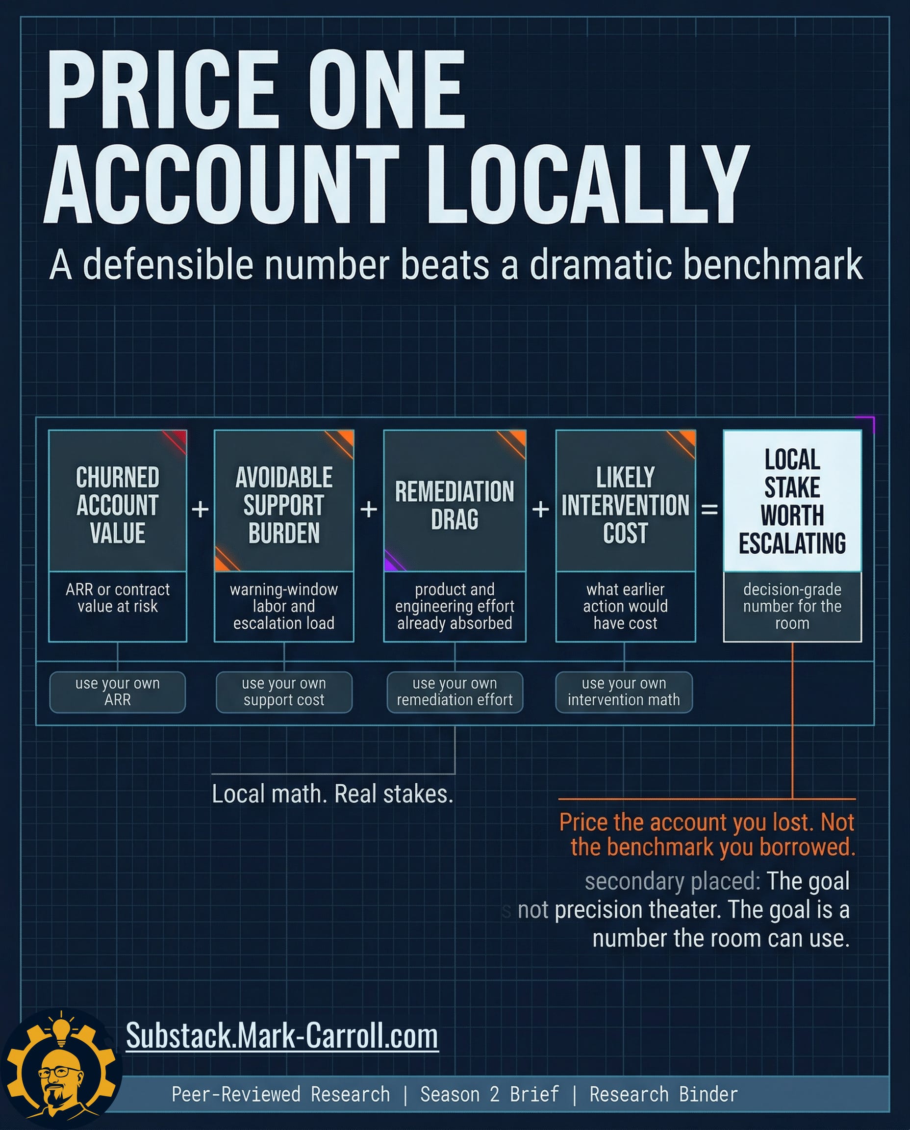
This is where most writing on churn gets sloppy. The evidence does not hand you a clean universal number for the cost of one churned enterprise account caused by workflow blind spots. There is no honest way to pull a dramatic industry benchmark off the shelf, drop it into a graphic, and call it proof.
Profit-sensitive churn work in adjacent subscription domains (telecom, banking, SaaS) consistently shows that financial impact depends on your own contract values, margins, and intervention costs. There is no portable industry number. There is only your local exposure, priced from your own systems.
The question is not, What does churn cost in the abstract? The question is, What did this account put at risk, and what did the warning window already cost before revenue recorded the loss?
Start with one account, not a portfolio fantasy. If an enterprise account carried $120,000 in annual value, generated roughly $6,000 in support and escalation labor during the warning window, consumed another $9,000 in product and engineering remediation effort, and would have required a $4,000 intervention six weeks earlier to force a serious recovery decision. The number worth discussing is not a generic benchmark. The number worth discussing is the roughly $139,000 of locally visible exposure attached to one account the system kept misreading as separate operating facts.
(This is an illustrative local calculation. Actual exposure varies by CLV, intervention cost, and response rate. The logic adapts CLV-based retention economics from adjacent subscription contexts and forces the math into your own account values; not borrowed benchmarks.)
The formula in your world:
Churned account value + avoidable support during the warning window + in-flight product and engineering remediation already absorbed + earlier intervention cost = the local exposure worth escalating on one account
Apply it now:
› Pull one churned enterprise account.
› Estimate these four components from your own systems.
› Use that total as your reference number in the next renewal-risk review.
That is the turn. The organization does not lose money only when the customer leaves. It loses money when it stores a recoverable warning as unrelated local metrics until the accumulated cost of delay exceeds the cost of coordinated attention.
The Churn Signal Scorecard
The goal is not another platform. The goal is a better review.
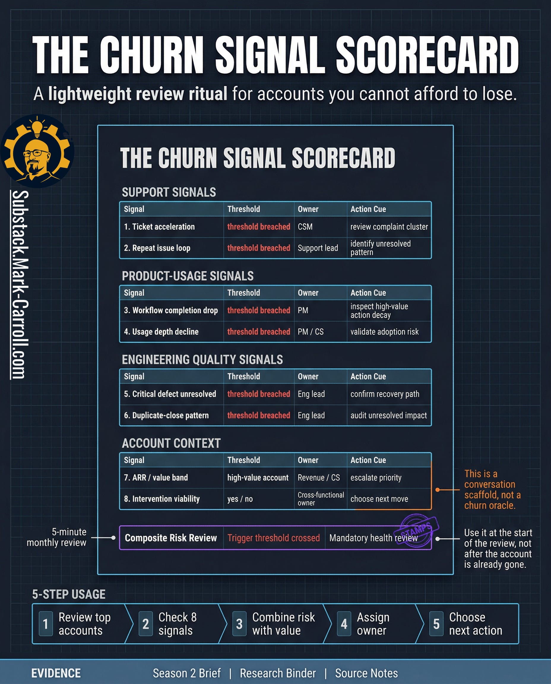
Once you can see the warning window and price one account locally, the next requirement is operational discipline. Not more dashboards. Not another score that promises to think for the room. A repeatable review: light enough to survive a real QBR, sharp enough to force a harder conversation, and bounded enough that leaders can use it without pretending it predicts the future.
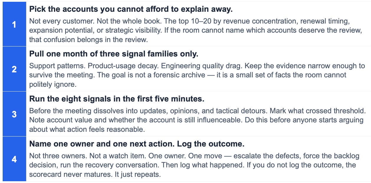
One page. Eight signals (for example: core workflow completion, high-value action abandonment, ticket acceleration, repeated complaint clusters, critical defect drag near renewal, duplicate-close patterns, account value band, and intervention viability). Each signal has a threshold, a named owner, and an action cue.
The point of the page is not to collapse judgment into a number. The point is to stop the room from pretending that separate local facts do not belong to the same account story. A threshold gets crossed. An owner gets named. A review becomes mandatory. The scorecard does not replace interpretation. It makes interpretation harder to postpone.
Cross out the generic labels and rename them into your team’s actual language. If your environment runs on Jira, track Blocked Status duration near renewal. If it runs on Zendesk, track Escalation Loop count. The scorecard only works if it speaks your stack on day one.
A good scorecard earns trust because it leaves things out on purpose. It reduces the room’s ability to hide behind local coherence. Not a prettier dashboard. A harder conversation, earlier.
What leaders should do next
The 5-Minute Review Ritual
Then combine risk with value. A high-risk low-value account and a high-risk high-value account do not belong in the same decision bucket. The review should force one hard distinction: which accounts are both at risk and still worth coordinated action now.
The immediate goal is not perfect prediction. The immediate goal is earlier coordination on accounts whose warning signals are already visible. Leaders do not need a mystical system. They need a lighter excuse to stop waiting.
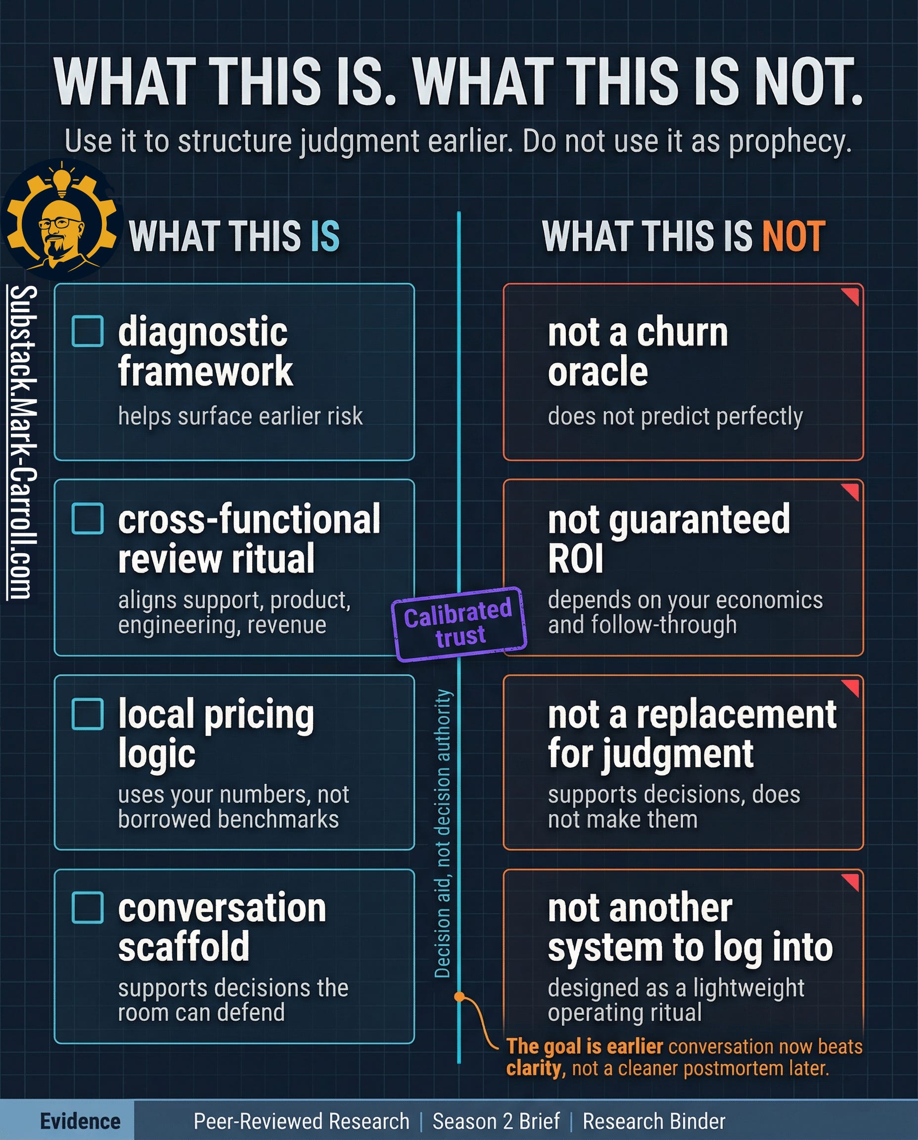
What this is. What this is not.
This is:
A diagnostic framework for surfacing earlier risk from signals your organization is already producing but rarely reads together in time.
A cross-functional review ritual that forces Support, Product, Engineering, and Revenue to look at one account through one frame before the loss hardens into history.
A local pricing logic that helps the room name what one weakening account is already costing.
A conversation scaffold for decisions people may disagree on but still need to make.
This is not:
A churn oracle. It does not predict perfectly.
A replacement for judgment, context, or follow-through.
A guaranteed ROI device. No page can override weak data, vague ownership, or a room that still refuses to act.
Another system to log into. The point is not to add software. The point is to make better use of evidence you already have.
That boundary matters because tools lose trust when they promise more than they can carry. A good scorecard earns credibility by being explicit about where it helps and where it stops. It helps the room see earlier. It helps the room compare risk against value. It helps the room name one owner and one next action while the account is still recoverable. It does not eliminate uncertainty. It does not excuse leaders from deciding.
Earlier clarity, not false certainty. A better conversation now, while the account can still be influenced, beats a cleaner postmortem later.
The closing point
Most organizations do not lose enterprise customers because the signal was missing. They lose them because the signal stayed trapped inside local systems that never became a shared commercial fact while the account was still recoverable. Support saw friction. Product saw delay. Engineering saw unresolved drag. Revenue saw the loss. By the time those realities finally met each other in one room, the room was no longer deciding whether to act. It was explaining why it had not.
That is the real cost of reading customer risk as separate operational trivia. The organization mistakes local handling for collective control. Tickets move. Requests stay alive in status language. Bugs leave the queue. Everyone can point to motion. The account keeps weakening anyway. A system that rewards local closure without shared escalation builds a culture where the warning is visible and still unusable.
That is why churn is rarely the first failure. Churn is the final receipt. The earlier failure is structural. The route between workflow evidence and revenue consequence never becomes strong enough, clear enough, or owned enough to force coordinated attention while attention still changes the outcome.
That is what the scorecard changes. Not the existence of the warning. The organization’s ability to act on it while acting still changes the outcome.
That is also the larger case behind my upcoming book, Collaborate Better. Better collaboration is not about being nicer in meetings. It is about reducing avoidable friction before it turns into waste, delay, and preventable cost. When systems fail to communicate, people absorb the damage. Collaborate Better is the manual for stopping that human and financial bleed. Learn more at CollaborateBetter.us.

Next week in Part 4: The Catastrophic Cost of Looking Safe

P.S. If your top accounts each carry support history, product history, and engineering history, but nobody on your team can quickly name which one looks most at risk before revenue does. That is not a visibility problem. That is the finding. What will you do with it?
Regards,
Mark 👋
Previous:

More Content to Discover:


Roadmap Keeps Breaking? 3 Fixes for PMs and POs

Top of the Series Arc: 🔒 Leader’s Dispatch: Weight Comes After Insight
Quick gut check: if you looked at your top 10 accounts right now, who on your team could name the one most at risk before revenue does, and what signals would they point to?
If the answer is ‘nobody,’ that’s probably the finding.
Where is the route breaking in your org?